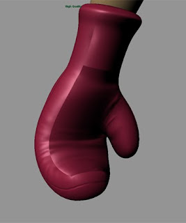
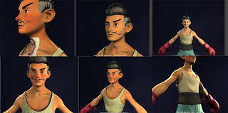
Posted a few pictures here on Thursday for the production meeting, and now I have a spare minute i'll elaborate on them, and complain about a few things while i'm here.
In fact I think i'll start the complaining right away. At the minute i'm feeling like i'm in a bit of a mess. My model is alright but not great. There's so much that I still don't know, e.g. practically everything to do with materials and texturing, and a whole lot of other stuff and it's kind of wearing me down. Apart from the textures that i've painted (a category in which you can probably only include the skin) I feel i've accomplished very little.
This would be down to a few things;
-Complete lack of knowledge in the area. I understand that this is the way that 3D, or as Derek said, everything, is as far as learning goes, but sometimes it's easier going than others.
-My nature. I seem to be unable to accomplish what I would like to - what I have in my head - due to my lack of knowledge, and it's leading me to continually tweaking and re-tweaking but making no headway. At least this is with the Maya materials. Mental Ray materials are a whole different matter, and bring up problems that so far I can't solve. For some reason the mental ray materials seem to require twice or three times the light strength as maya materials do, which must be something to do with a setting in my Maya, because it doesn't seem to be happening to others in tutorials i've watched. I digress.
-Lack of motivation. I think a combination of the above and other influences have depleted my motivation a little. I can't deny that I haven't been working as hard as I have been previously, and I find myself getting easily distracted by any old rubbish I find on the internet. Rendering things probably doubles the procrastination also, as when you're rendering there's potentially a few minutes where Maya is unusable, and unless I have a pencil and paper in front of me then I just end up getting sidetracked by facebook or some other timewaster.
Doom and gloom aside, I've learnt a hell of a lot throughout this whole process, and the year so far. More than I thought i'd have learned really. And (this should be my catch phrase the amount of times that i've said it recently) I really think that the next character I make will be twice as good or better than my current guy (or perhaps i'm forgetting the hardships of basemesh modeling a little?). I'd be happy to leave this guy as he is and just bank the knowledge that i've gathered, but I think that'd probably be poor form, so i'll press on and tbh I think the outcome will at least be decent.
But yeah, lighting is a bugger. Don't think I like lighting at all. Sucks that my rigs are failing for Andy, too, but I guess that's another thing to learn from. Onto the pics.
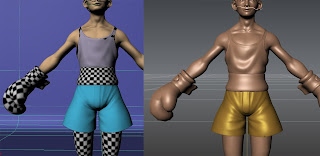
Here's an ugly little example of the woes I faced in the world of normal maps. This'll be the last time I dwell on them I promise :P (although Georg did suggest doing my innovation project on them... I do think that'd save a few people some stress if they actually read it, but I would quite like to make a monster hand.)
Anyway, the right is my hi-res sculpt, and the left is the disgusting translation that I was presented with in Maya using my very first normal maps. Crap right? Well after a hell of a lot of effort I figured it out, and here's a little rundown of what I was doing wrong.
1. UVs were bad. Make your UVs correlate as closely as possible to the polygons which they relate to. It's as simple as that, but tedious work.
2. The artifacts on the vest are due to the geometry of the basemesh and the way which Mudbox read the hi-res mesh when it was baking out the normal maps. Since the mesh is two-sided, I believe mudbox was bringing through the inner-layer of the vest when I only wanted it to sample the front. To remedy this, choose "Furthest outside" as an option when creating your normal maps. (This method will potentially throw up some new errors if the geo you're creating normals for has more geometry close to the outside. e.g. when I used this setting on the shorts, the inside leg of the shorts had the opposite leg imprinted on it.)
3. To a lesser extent, and at the risk of telling the obvious, different materials react differently to light. Duh. Obviously the shiny materials in Mudbox will look different to the lamberts I used in Maya. Next time I sculpt I plan to use approximations of materials and possibly colours from the get-go in Mudbox.
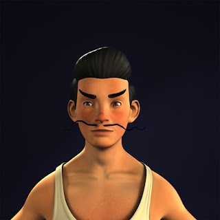
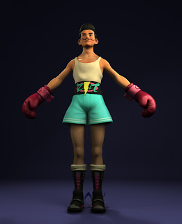
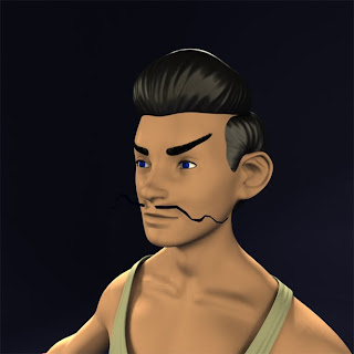
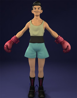
That's enough of that. Here are some screenshots of where i'm at currently.
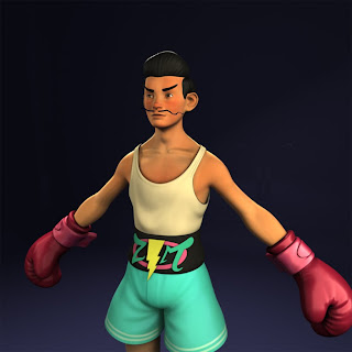
Pretty? Hope so... don't think it'll be a whole lot different when all is said and done, but it'll have to do for now.
Next week, to give myself some purpose and direction, I'm going to start rigging him. I want him rigged and weighted by Friday. It's a challenge, but one which I intend to complete. If I don't get him done i'll be a goner. That's all for now. See you next week bloggers.
Thursday, 18 March 2010
Sunday, 14 March 2010
Evening.
Hi there. Ain't posted for 2 weeks so hopefully i'll have quite a bit to show :)
What i've done:
-Finished hi-res sculpt :D
-Figured out normal mapping (huge achievement for me)
-Started textures and materials.
Hi-res Sculpting
First off - here he is :)
Slightly dodgy video as I was using a new plugin that I downloaded, but it should be alright. Also before I start talking about it, as a note only his right glove is sculpted, as I planned to mirror it for the right glove and also his socks have been modeled since then. Right.
Mudbox is pretty cool. I found it a little daunting getting used to it, but that's more because of the fact that I had all of the tools needed to create amazing art and it was just down to me now. Most of the tools work as you'd expect them to (not got the hang of flatten yet) and the interface is fairly simple and very intuitive compared to zbrush. Especially when you've just come from Maya, as it uses most of the same shortcuts and such too.
I had a few niggles here and there, mostly involving normals (not mapping, just the normals facing the wrong direction etc), had a little trouble with instanced objects also but that was pretty standard sorting out. Apart from those minor setbacks though, I feel i'm sort of settling into it, albeit slowly.
When modeling in Mudbox I get the same feeling as I do when painting in photoshop. There's so much scope for tweaking this and that and redoing bits that sometimes I get caught up in one tiny, potentially insignificant, area, and I start to waste time. Being a perfectionist can be a hinderance, and sometimes you just have to stop yourself. It can also be intimidating changing areas because you're scared that the changes you make won't be as good as what you already have. I think this is one of the reasons for the hi-poly being relatively... tame? I didn't really push the sculpt to any extreme, but I think this may also be because of the nature of the character and my lack of expertise with the software. Anyway i'm satisfied with what i've done and look forward to my next sculpt (which I reckon will be much better).
Normal Mapping: O
So after the stuff I was on about last week (which i'm too lazy to read back over, I talk too much :P) i've learnt a bit about normal mapping. After i'd sculpted the shorts and the shirt I started baking out the maps using mudbox. But annoyingly they didn't look how I wanted them to. I didn't take any screenshots, but the shorts were very pixelated and the vest was just looking ugly. The maps weren't working how I wanted them to at all. I couldn't find any good tutorials online so I was working purely by trial and error, and tried a million and one things to sort them out.
I tried making the maps bigger (4k square they're currently at. I still don't know if that's a bit extreme or not, but it's the highest mudbox will allow.) That didn't seem to sort it, so I tried using TIF instead of PNG which involves taking the new TIFs into Photoshop and resaving them without any sort of compression as mental ray doesn't support it, leaving them at like 200MB each which is seemingly a bit excessive. Very little difference there either. I tried using different basemeshes, I tried using a different program called xNormal to generate my normal maps, still nothing. So I went back to the UVs, a potential problem i'd thought of but put at the bottom of the list, tweaked a few bits and bobs your uncle :D The problem was that the UVs that contained the most important bits of detail on both the shorts and the vest (the two areas i was testing on -- bit of a coincidence) didn't have enough space. The UVs were squashed up and as a result the normals came out crappy as they were stretched over a bigger area than they were meant to be. Felt great when I finally got them working. Seems like UVs are a big deal! Here's a little run-through of how i've been doing my normals, and how they seem to work best, just in case you care or could find it helpful.
-Start with a tidy basemesh. This includes frozen transformation, normals facing the right way, no instances, deleted history, GOOD UVS! all that good stuff.
-Take into mudbox, sculpt your hi-res stuff. (Make sure smooth target UVs or whatever it's called is checked before you start subdividing the mesh, cause Cherie said so)
-Go to export your normal maps
--Here i've currently been using the level 0 model in mudbox as the target mesh and the highest level as the source, (think that's right) but I think in the future i'll take the highest level into Maya, pull the verts of the original basemesh a little to fit the hi-res, and use that as the target as long as the computer can handle it. This is because the level 0 can get a bit mooshy and lose some detail during hi-res sculpting.
-TIF for format, 4k for size, (use whatever you want/need.) and i've been using closest inside and out unless the model has two sided, like the vest which seemed to glitch out the normal maps. In that case I used furthest outside, and i've also been using best guess for the distance thing.
That's all I can think of now, I did do a little writeup on a piece of paper but i dunno where he is.
That's enough chat, here are some pictures of my normal mapping experience, with a few dodgy materials thrown on.
Looking at these now they don't actually show off the mapping too well, blinns are better for that, but the end material won't be a blinn so I went with a lambert. Also I turned up ambient colour as it made it pretty, but that wont be on neither. I think that's making it look a little more washed out.
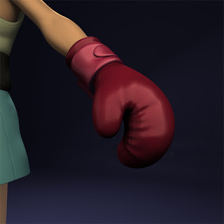
Pretty good example here. Glove is very low poly but looks just as good as the hi-res!
Face for face's sake. I'm not sure why, not even sure if the normal map is on there lol.
Here's a weird glitch that happens in the viewport. You can see the seams really badly, and I tried fixing this in photoshop for a while until I realised that it doesn't actually show in the render. Duh.
Texturing/Mats
I'll keep this short as i'm getting tired, but that should be easy as i've only recently started with the texturing. Here's a few screenshots of the texture in progress! :D
I think it's going pretty well. You can see the reference i'm using comically plastered on his chest. This won't be in the final version :P The look i'm going for is sort of pristine I guess, but I really like a little bit of sort of real life skin texture here and there. I did try to find pictures I could use to project onto him but I didn't really know where to look. I've only really worked on his cheeks and his nose so far but yeah.
One thing that's bugging me is SSS. I'm still having problems with the skin shading, and looking at how little time we have left I don't think it makes much sense to spend any more time on it, all for a little glow in the ear. I might pick it up when I get to my next character or maybe I will do it. We'll see. I think i'm about 2 weeks behind as it is but i'm really hoping that I don't get any more tripups and can just power through the rigging etc and make up a little time. We all knew it wouldn't be as easy as it sounded right? To be honest there are a ton of things that I don't like about this guy, but I just don't have the time to fix them. The bottom line is that he looks alright -- passable, and that's alright for now. He is my first fully finished hi-res sculpted model after all. I'm really looking forward to going on to the next guys as like I say, they'll be waaaaaaay better. I've learnt a whole lot and look forward to mastering what i've learnt :) That'll do for now. Laters!
What i've done:
-Finished hi-res sculpt :D
-Figured out normal mapping (huge achievement for me)
-Started textures and materials.
Hi-res Sculpting
First off - here he is :)
Hi-Res Lightning Mike Sculpt Turntable from Jacob Golding on Vimeo.
Slightly dodgy video as I was using a new plugin that I downloaded, but it should be alright. Also before I start talking about it, as a note only his right glove is sculpted, as I planned to mirror it for the right glove and also his socks have been modeled since then. Right.
Mudbox is pretty cool. I found it a little daunting getting used to it, but that's more because of the fact that I had all of the tools needed to create amazing art and it was just down to me now. Most of the tools work as you'd expect them to (not got the hang of flatten yet) and the interface is fairly simple and very intuitive compared to zbrush. Especially when you've just come from Maya, as it uses most of the same shortcuts and such too.
I had a few niggles here and there, mostly involving normals (not mapping, just the normals facing the wrong direction etc), had a little trouble with instanced objects also but that was pretty standard sorting out. Apart from those minor setbacks though, I feel i'm sort of settling into it, albeit slowly.
When modeling in Mudbox I get the same feeling as I do when painting in photoshop. There's so much scope for tweaking this and that and redoing bits that sometimes I get caught up in one tiny, potentially insignificant, area, and I start to waste time. Being a perfectionist can be a hinderance, and sometimes you just have to stop yourself. It can also be intimidating changing areas because you're scared that the changes you make won't be as good as what you already have. I think this is one of the reasons for the hi-poly being relatively... tame? I didn't really push the sculpt to any extreme, but I think this may also be because of the nature of the character and my lack of expertise with the software. Anyway i'm satisfied with what i've done and look forward to my next sculpt (which I reckon will be much better).
Normal Mapping: O
So after the stuff I was on about last week (which i'm too lazy to read back over, I talk too much :P) i've learnt a bit about normal mapping. After i'd sculpted the shorts and the shirt I started baking out the maps using mudbox. But annoyingly they didn't look how I wanted them to. I didn't take any screenshots, but the shorts were very pixelated and the vest was just looking ugly. The maps weren't working how I wanted them to at all. I couldn't find any good tutorials online so I was working purely by trial and error, and tried a million and one things to sort them out.
I tried making the maps bigger (4k square they're currently at. I still don't know if that's a bit extreme or not, but it's the highest mudbox will allow.) That didn't seem to sort it, so I tried using TIF instead of PNG which involves taking the new TIFs into Photoshop and resaving them without any sort of compression as mental ray doesn't support it, leaving them at like 200MB each which is seemingly a bit excessive. Very little difference there either. I tried using different basemeshes, I tried using a different program called xNormal to generate my normal maps, still nothing. So I went back to the UVs, a potential problem i'd thought of but put at the bottom of the list, tweaked a few bits and bobs your uncle :D The problem was that the UVs that contained the most important bits of detail on both the shorts and the vest (the two areas i was testing on -- bit of a coincidence) didn't have enough space. The UVs were squashed up and as a result the normals came out crappy as they were stretched over a bigger area than they were meant to be. Felt great when I finally got them working. Seems like UVs are a big deal! Here's a little run-through of how i've been doing my normals, and how they seem to work best, just in case you care or could find it helpful.
-Start with a tidy basemesh. This includes frozen transformation, normals facing the right way, no instances, deleted history, GOOD UVS! all that good stuff.
-Take into mudbox, sculpt your hi-res stuff. (Make sure smooth target UVs or whatever it's called is checked before you start subdividing the mesh, cause Cherie said so)
-Go to export your normal maps
--Here i've currently been using the level 0 model in mudbox as the target mesh and the highest level as the source, (think that's right) but I think in the future i'll take the highest level into Maya, pull the verts of the original basemesh a little to fit the hi-res, and use that as the target as long as the computer can handle it. This is because the level 0 can get a bit mooshy and lose some detail during hi-res sculpting.
-TIF for format, 4k for size, (use whatever you want/need.) and i've been using closest inside and out unless the model has two sided, like the vest which seemed to glitch out the normal maps. In that case I used furthest outside, and i've also been using best guess for the distance thing.
That's all I can think of now, I did do a little writeup on a piece of paper but i dunno where he is.
That's enough chat, here are some pictures of my normal mapping experience, with a few dodgy materials thrown on.
Looking at these now they don't actually show off the mapping too well, blinns are better for that, but the end material won't be a blinn so I went with a lambert. Also I turned up ambient colour as it made it pretty, but that wont be on neither. I think that's making it look a little more washed out.
Pretty good example here. Glove is very low poly but looks just as good as the hi-res!
Face for face's sake. I'm not sure why, not even sure if the normal map is on there lol.
Here's a weird glitch that happens in the viewport. You can see the seams really badly, and I tried fixing this in photoshop for a while until I realised that it doesn't actually show in the render. Duh.
Texturing/Mats
I'll keep this short as i'm getting tired, but that should be easy as i've only recently started with the texturing. Here's a few screenshots of the texture in progress! :D
I think it's going pretty well. You can see the reference i'm using comically plastered on his chest. This won't be in the final version :P The look i'm going for is sort of pristine I guess, but I really like a little bit of sort of real life skin texture here and there. I did try to find pictures I could use to project onto him but I didn't really know where to look. I've only really worked on his cheeks and his nose so far but yeah.
One thing that's bugging me is SSS. I'm still having problems with the skin shading, and looking at how little time we have left I don't think it makes much sense to spend any more time on it, all for a little glow in the ear. I might pick it up when I get to my next character or maybe I will do it. We'll see. I think i'm about 2 weeks behind as it is but i'm really hoping that I don't get any more tripups and can just power through the rigging etc and make up a little time. We all knew it wouldn't be as easy as it sounded right? To be honest there are a ton of things that I don't like about this guy, but I just don't have the time to fix them. The bottom line is that he looks alright -- passable, and that's alright for now. He is my first fully finished hi-res sculpted model after all. I'm really looking forward to going on to the next guys as like I say, they'll be waaaaaaay better. I've learnt a whole lot and look forward to mastering what i've learnt :) That'll do for now. Laters!
Subscribe to:
Posts (Atom)