Sunday, 16 May 2010

New Stuff!

So i've not blogged in two weeks I think, been really busy in uni recently working full bore trying to get these characters out for the final show. I really want to be able to show something that i'm proud of or it'll be a nightmare. So over these last two or three weeks I've been working on my second character and he's almost finished :) Sadly I didn't manage to finish him this week but i'm giving myself one more day to finish it and that's it. Then I have two weeks for my final character, really tough but I think I can do it (there'll just be a lot of late nights in the studio).

Without further ado here's my last two weeks in pictures.
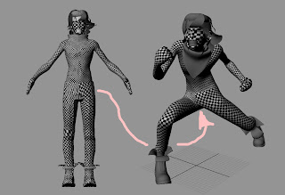

So I left off last time I believe when I had just finished modeling. Don't think I'd started UVs just yet. Anyway, here's my guy after I'd finished UVs. I must admit that I was quite messy with this project as I wasn't really sure of my workflow. I initially modeled him then got to posing without doing the UVs. You can see the posed model on the right and the T-pose model on the left. I posed him using a super crude rig that took a few minutes to make (and really I should've put more time into is as it threw up a few problems later on that could've probably been fixed earlier with more preparation.)

So. I had the posed model and the original model, but then I was like 'crap, how do I uv a model in such an extreme pose? That'll be tricky' so Andy suggested using blendshapes, which turned out to be a damn good idea. So I started UVing the t-pose model (and by the way I usually UV one side and then mirror it, saves a lot of time. Half way through I thought i'd ruined everything by mirroring it as I thought the blendshapes wouldn't work... but they did, miraculously.) and finished it up and that was all grand.

Above you can see both of my models. I found that when I originally applied the blendshape, where there was a lot of distortion in the mesh due to the poor weighting, the UVs went a little dodgy. So I went back into the UV editor and using the posed model I tweaked the UVs for better distribution. That's what the arrow in the pic is trying to show. The trousers on the t-pose model look dodgy, but when in it's action pose it's decent. So that was that.


I made this picture to take a look at the pose, which i'm actually pretty happy with. It's quite faithful to the scribbles I did and I think it looks fairly dynamic which is good.
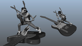

Here's the basemesh smoothed, looking pretty horrible, but what i'm trying to show is the guitar (would you have noticed? :P) I modeled the guitar using some reference and then duplicated it a million times for a laugh. I like the idea of having a guitar stand though, I might actually use that in the final. Happy accident!
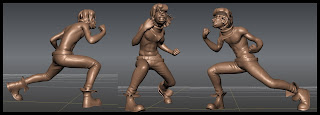

And here's where i'm at now! Almost finished mudboxing the guy :D all but the hair really, and i'm quite happy with what i've gotten. This probably doesn't show it off to it's fullest but hopefully my final reel will do that! I've enjoyed this stage a surprising amount. It's a good laugh using mudbox when it's going right for you. I had some trouble with the hair as originally it was a load of separate objects which I had to laboriously combine together, but now that's done and an hour or two and it should be complete :D can't wait to get him textured and finalised. Georg is gonna help me with the renders and hopefully he'll be beautiful!

So that's what i've got as far as 'real' work goes, but here're the little buggers that i'm blaming for me not hitting my target of completing that guy on friday. Friday was also the deadline for business cards and postcards, and being a perfectionist I buggered around with these for hours. Luckily they look good in the end and it's important to make a first impression, or so they say, so it's not all bad. Here are some .PNGs of my cards. I'm reeeeeeeallllyyyyyy hoping that they come out this colour, as some weird stuff has been happening with previewing the files that I made. In photoshop the TIFs (which are the files I sent off to be printed.) look great, just like these. If I save out .JPGs from the TIFs, they look dark and inferior. If I PREVIEW the TIFs in windows media preview they look like the crappy JPGs but in photoshop they look fine?! Arg. Hope for the best, assume the worst. Here they are anyway.
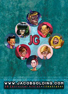

Snazzy yeah? I'm in the process of creating my website (which is much more complicated than I thought, but is being paid for by my brilliant cousin as a graduation present :D) and i'll probably go now right away and transfer some of these graphics :) Seeya in a week or two.

Monday, 3 May 2010

For Steve

Modeling for Andy Fossey's 'Corked' short film. (Turnarounds provided by Andy.)


Compilation of characters and a few finished concept paintings from my final major project


Sketches from the same project


3D iteration of one of the above characters (Work in progress)


Turntables of the pirate characters along with a video I put together as a pitch for the other project can be found on my Vimeo Account here.

Thanks for looking!

Postings

Alright, I haven't posted in a while. Hopefully I have enough stuff to show to redeem myself. Since the last post, I've been working on my new character, Sam, and also helping Andy with some more character rigging.

As rigging is possibly the most boring thing in 3D to talk about, i'll gloss over that (but don't you forget I did it!) and instead talk about the character, including pretty pictures.

So to start off I compiled a little folder of images to use as inspiration for the piece, along with a few sketches and other bits and bobs. Around the time I was scouring the web for pictures I came across an article, by chance, on Mick Jagger who must've been some sort of subconscious influence on my guy because they aren't too disimilar.


The main thing that I liked about these shots of Jagger was his ridiculous gurn, most of all his mouth, which was the sort of expression that i've wanted Sam to have for some time.

And then out of nowhere, here we have a disturbingly attractive shot... weird, but I like the contrast.

This is another image I picked up. Real life sculpting, folks, but obviously whether it's digital or RL, it's not so different really. The mouths, again, I thought would be helpful. Also the lion-o sculpt is boss.

This is one of the first few pages I drew of Sam that I thought fit his personality.
And after many attempts, here is the turnaround sheet for Maya. This was pretty difficult to get right. I wanted him to look fairly unhinged but not axe-murderer or mental asylum mad.

A fairly crappy looking pose sheet (so bad at these, really need to practice.) I went for the one on the middle right. You'll see in a second.

So I got to modeling. I decided to model him in a traditional static pose and make a crude rig in Maya to get the rough pose which I would later take to mudbox to make pretty. Above is me testing out a bunch of different render settings, trying to get rid of the grainyness in the shadows. Didn't really work, need to figure it out for final renders.

Close-up of his face. It's really difficult to get an accurate translation from 2D to 3D I find. Especially in Maya since it's quite restricting as far as if you want to make major changes then it takes a good bit of time. He looks like he's possibly passed into the realms of mad-mad, but I think i'm leaving him like this until mudbox, where I find it much easier to change proportions and stuff. A little worried about bringing him back into Maya after that, though. Do I retopo? Disp maps maybe? Hmm.

Well that was pretty sharpish. Finally I'll leave you with a link to the turnaround (will probs embed later). This is where i'm currently at: http://vimeo.com/11428114
He's posed, needs a few tweaks and to be UVd but then it's into mudbox :D (should I have UVd before posing.. perhaps.)

P.s. Website is well underway, and it'll be an awesome one :D when that's done i'll probably start blogging there instead. Anyway, seeya soon!